subscribe about contact Default
Showing posts with label art. Show all posts

Thursday, July 31, 2008

Dark Knight Illutsration by Frank Stockton


This Dark Knight illustration, which is really bad ass, was done by Frank Stockton, a highly talented illustrator whose done work for publications such as ESPN the Magazine, GQ, and Forbes. His name's been floating around recently, but no one seems to be mentioning this specific illustration which I think is about as well done as you can get. It's also interesting to me that that a movie adapted from a comic book hero would inspire what the elite would call "high art". Get over to his blog and let him know how great he is. Oh, and ask him to give us a high resolution version.


FULL POST

Friday, July 25, 2008

New Prints from Si Scott

Si Scott has become one of my favorite graphic designers in the short time I've been keeping up on the art form. The guy is by far the best typographic magician right now, adopting a style that is highly intricate and elegant--and entirely his own. I obsess over it so much that it's inspiring my next tattoo. Anyway, Scott, in collaboration with Hype Type Studio, has some new prints for sale and, per usual, they receive my admiration.

(Found via Why Me?)

FULL POST

Thursday, July 17, 2008

Ghostco

Matthew Woodson's portfolio, Ghostco, reminds me of a mix between A Scanner Darkly and some unnamed graphic novel. A lot of what I posted lately in the graphic design department may overload the eyes a bit, so this is a nice change of pace I think. There's something to be said for the beauty in his color schemes and thin lines. Seems as though others agree--he's racked up quite an impressive clients list including ESPN Magazine, American Express, and Wired Magazine. This from a guy who graduated two years ago.

(Found via Changethethought)


FULL POST

Tuesday, July 8, 2008

Pablo Alfieri's Portfolio, "Playful"

Pablo Alfieri impresses me much. I like that he isn't limiting himself either; even though his print work is pretty phenomenal, his venture into the 3d medium for his piece "The 90's" is about as awesome as it gets for us nostalgic types raised on Nickelodeon and Nintendo.

(Found via The Serif) FULL POST

Thursday, June 19, 2008

peter callesen's paper cut outs are mind-bogglingly intricate

I once got a tutorial on how to make paper snowflakes of various themes. Themes being ones that aren't, you know, snowflakes. I think the one I did was a wolf or something. Long story short--for the sake of maintaining your sanity--cutting that little wolf out, that little pre-traced wolf, was not only physically difficult but mentally taxing as well. Working a pair of scissors around sharp edges and minute details is boring and made worse by the difficulty in doing it. Then someone like Peter Callesen comes along and proves to me that handling shears is probably not my life's calling.

Callesen hails from Denmark and has been doing all kinds of paper cut artwork that, while looking great, is more awesome because you know when you see it that it had to be excruciatingly difficult to accomplish. His work ranges from small, A4 pieces, to huge, room-sized paper models. Take a look through his gallery and have a new appreciation for card stock. FULL POST

Monday, June 16, 2008

scott wade's dirty car art

The urge to write or draw on a dusty back windshield is something I possess and I assume it lies within everyone. However, the extent of my creativity when taking to the glass canvas lies somewhere between writing "DOUCHE BAG!" and drawing an erect penis with a disproportionate set of testicles. Scott Wade, on the other hand, has a brain and has done some pretty unbelievable "Dirty Car Art", ranging from recreations of the Mona Lisa over Starry Night, to portraits of Albert Einstein, to creepy Elf-dudes. What's really cool is the "impermanent" nature of his work; Wade says, "One of the cool things about them is how they change over time. More dust accumulates as the car is driven down the road. Early morning dew streaks and dots the image, creating a patina. A light shower creates a deeper patina."

Check out his gallery (1, 2) to see his work. FULL POST

Thursday, May 29, 2008

maurizio cattelan

Maurizio Cattelan's sculptures are straight creepy. This horse one is tame compared to some of the others, but it happens to be my favorite. There's something symbolic about it, which is always the case with horses.

(Found via It's Nice That) FULL POST

Tuesday, May 27, 2008

dan mumford's illustrations

I've been posting a lot of design work, and sometimes I feel like I'm just showing the same thing over and over. But, I'm not. It's just a testament to the extraordinary talent right now in the design scene. So, per usual, here's some more work from a designer by the name of Dan Mumford.

Mumford's illustrations have a cool, controlled chaos effect; something I've been really into as of late. The piece pictured above, titled "Francesca", is both crazy and simple. The use of color is awesome, too.

(Found via It's Nice That) FULL POST

minimalexperimental launches

Intended as "a platform for online and offline design exhibitions," Minimalexperimental just recently launched and includes exciting work from up-and-coming graphic designers. There's also a little interactivity to it, incorporating a comment system that displays right on the home page. Being faithful to its name, the site's design is straightforward and stripped down, letting it all hang out on just one single page.

(Found via Design You Trust) FULL POST

Tuesday, May 13, 2008

enyo creative guitar modification

Artist Josh Kenyon, of Enyo Creative, took some of his creativity and plastered it on a guitar. I really wish I had a nice custom guitar with some cool artwork on it. Actually, I wish I was good enough to warrant a nice custom guitar with some cool artwork on it. It still doesn't mean I can't admire it, though.

(Found via Changethethought) FULL POST

Friday, May 9, 2008

bansky keeping it real real at the cans festival

Believe you me, The Cans Festival isn't just some awful play on words--there was actually some really great graffiti work going on at the "stencil art street battle" held in London these past few days. According to the website, "Some people are calling it the greatest stencil art show that has ever taken place in a tunnel underneath Waterloo station." Eh, I beg to differ. But really, it's all very nice and good. Bansky, a man who needs no petty introduction, put on a show of his own. A show within a show, some may have called it.

Another piece done by Bansky at the show:


(Found via Kitsune Noir) FULL POST

Thursday, May 8, 2008

scott hansen/iso50/tycho, you've wowed me

I really don't like the look of 95total--at all--so I spend a good chunk of time in the various crevices of the Internet trying to find some sort of inspiration for a new design. I somehow came across this ISO50 site, which is "The Visual Work of Scott Hansen". I'm blown away by this guy's art, which spans across print, logos, web, and photo. He's got this way cool vintage vibe that's not unlike something you'd see on a Boards of Canada album cover. A lot of it's real 60s/70s with a good grounding in contemporary design.

But then, the kicker (which made me feel I had either come across an undiscovered gold mine of talent, or that I've been tucked away in my basement too long eating Girl Scout Cookies and playing 360 to ever hear of the guy) is that he dabbles in the trade of beats and melodies. On the ISO50 portfolio site you notice there's some music accompanied to your viewing. Turns out those are Hansen's chilled-out tunes penetrating your skull. Under the name of Tycho, Hansen tours and plays venues all over, creating very good IDM/electronic music that's not unlike, get this, Boards of Canada. I smell some influence.

Seeing how proficient this guy is in multiple areas has me impressed and wanting to develop my own abilities in those areas. Oh, and he blogs, too. Quite the show off, eh Scott?

Check out what this guy has to offer; it's a lot. FULL POST

Friday, April 25, 2008

hey, some more great studio work, this time by changethethought. are you annoyed yet?

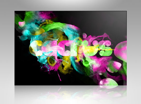
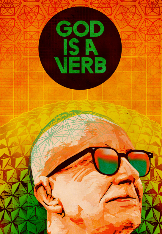
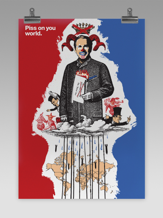
I'm a madman about this art stuff--I feel so, I don't know, cultural. It's like I'm aggregating culture. Anyway, I found the online portfolio of Changethethought today and was, yet again, blown away. The works range from vivid prints displaying brilliant blasts of color (see above), to typography for bands like The Postal Service, to what looks like acid-induced illustrations. In addition to their portfolio, the site also hosts a blog about design and art, among other things, as well as a shop to buy some really cool apparel sporting their art.

To learn more about Changethethought, visit their About page.

Here are some of my fav's:
Cactus, Evil, God is a Verb, and Piss on you world.

(Found via FormFiftyFive) FULL POST

brett ryder's portfolio

I'm not sure if I've just been ignorant to it all, or if the rest of the world is joining in on this celebration of art, but I found some more visual goodness in Brett Ryder's illustrations. His work is surrealist with a little bit of that old school (like old old school) theme. Some of the stuff can be pretty colorful, too. Check it out.

(Found via Seiz whaa?) FULL POST

lukas geronimas' complimentary watercolor

Lukas Geronimas did some "touch-up" water color work to these photographs of mountains and they look really nice. The shots remind me of Ansel Adams, who happens to be my favorite photographer. According to Geronimas:
"A while back, while preparing collages which went unused for our show at OKOK Gallery, I decided to add colour, line and form to a title page that already looked very nice, as I felt I could add to the design and give it a new life. It turned out looking kind of beautiful, so I recently decided to further explore this process. My first series of these 'Spring Drawings' (since they are once again fresh and lively pages of dormant imagery) consists of seven works - three of which are black and white. I did my best to make them look, well, really complimentary, and I had fun doing it."
I really like the technique; does anyone know if any other artists do this, because I'd like to know?

(Found via HELLO BAULDOFF) FULL POST

Thursday, April 24, 2008

ill studio's portfolio is awesome


The portfolio for Ill Studio is just crazy. Ranging from all sorts of media, this French design studio is producing some fine artwork for everything from magazine covers, to t-shirts, to snowboards, to products for France's oldest wax and candle factory. Oh, yes, they got some diversity.

If you don't like the picture posted, fear not. Everything is so radically different that you'll find something you dig. I managed to find a few, if not everything.

(Found via Delicious Ghost) FULL POST

more unorthodox coat hooks. too bad it's spring (in this hemisphere).

My friend Lauren over at Double Takes managed to find an eerily similar concept to the knife coat hooks I posted a couple weeks ago: tree branch coat hooks. They're designed by Max Lipsey and made out of aluminum. I really enjoy the design; it's continuing with the organic/seamless trend that so many people seem to be headed towards. However, I looked around Lipsey's site and it seems that they aren't for sale; they are, instead, meant more to be art/design. Cool, nonetheless.

(Found via Double Takes) FULL POST

Monday, April 21, 2008

more diy: youth guitar turned functional radio

What can I say--we're crafty. Just last week Rich unveiled his all-too-authentic retro iPod speaker unit; and although impressive, he's the first to admit that he had some help in the matter--from a good friend by the name of Randy. Randy's also in the diy business, recently completing his youth guitar turned functional radio.

Of the project, Randy said:
I took a youth guitar that had a mini amplifier and speaker in the body and a 1980's am/fm radio and combined the two. The [original] radio was gutted for parts and retro-fitted into a made-from-scratch body for the guitar. I used all old parts from the original guitar except the tremelo bridge. I added wood to the headstock to make an exaggerated "Stratocaster" style head.
Aside from the coolness of the radio, it stands as an art piece as well. While Randy said to me that it's "a statement about appearances in the music industry," the work, to me, resonates as a criticism towards the creative possibilities of an instrument as dwindled through a corrupt medium of communication. But, hey, I may be a tad cynical about all that stuff.

What do you make of Randy's work?

More pics of the finished project here, here, and here. FULL POST

Friday, April 18, 2008

graffiti taxonomy project


You never knew there were so many ways to express the letter 'e', but then again you may not be a graffiti artist. I took notice to Evan of F.A.T.'s "Graffiti Taxonomy Prints" and really enjoyed the overall design and quality of the works. According to Evan:
"In 2004 I released a project called Graffiti Taxonomy and since then I have been receiving regular email requests to make prints and posters. I have recently revisited the project and am now releasing my first ever series of limited edition signed and numbered prints. The Lower East Side ‘E’ was created from tags photographed in March of 2008. It is the first in an ongoing series of graffiti character studies titled ‘A,E,I,O,U’. The prints were made by master printers right here in Brooklyn and can be purchased at the new ni9e store."
Looking at the prints made me realize the diversity and yet the near-science that graffiti artists posses. I feel like I've seen a lot of the various 'e's and 's's, but to see them in conjunction is very cool.

(Found via F.A.T.) FULL POST

Wednesday, April 16, 2008

'skine art

Just found this inspiring little blog, "dedicated to moleskins lovers and their art," called 'skine art.

I happened to come across this only minutes ago, but already am really impressed by the artwork. The site fosters some sort of psychological voyeurism. It's like picking up someone's notebook they left after class and seeing what runs through their mind and yet keep from the rest of the world.

(Found via Boing Boing) FULL POST

 
©MMVIII 95TOTAL \\ CONTACT JAKE \\ CONTACT RICH \\ POWERED BY BLOGGER